It takes much more than that.
There is, also, another saying… first impressions count. As an exclusively direct brand, we’re especially mindful of this. Our online store offers great advantages – eliminating third party costs to enable us to present exceptional haircare quality and performance proudly made here in the UK at an accessible price. Conversely though, our lack of physical presence considerably reduces opportunities to tell our story, demonstrate the sheer quality of our products and share the remarkable results they deliver. For us therefore, there are no second chances when it comes to making an impeccable first impression.
Chāmpo has a unique story to tell – an extraordinary interplay of pioneering hair science, renowned botanicals and ancient wisdom.
To do it justice, each and every detail of our brand needs to work doubly hard to convey all we have to offer with meaning and impact. This most certainly includes our bespoke packaging – which we discuss in this Journal article – but it also extends to the models featured in our images; the colours, textures and fabrics they wear, how our products and ingredients are depicted, and the art direction of every shot.
As with our bespoke bottle design, we approached this task with a blank sheet of paper. First and foremost, Chāmpo images must be unburdened by the homogeneous glamour so often present in the beauty industry. They should inspire our audience, depict the substance and soul of what we stand for; capture our inherent contemporary outlook and subtle British style while still reflecting our heritage. Ultimately, like our exceptional formulas and the bottles they are contained in, our imagery must be beautifully composed, unquestionably authentic and impeccably finished.
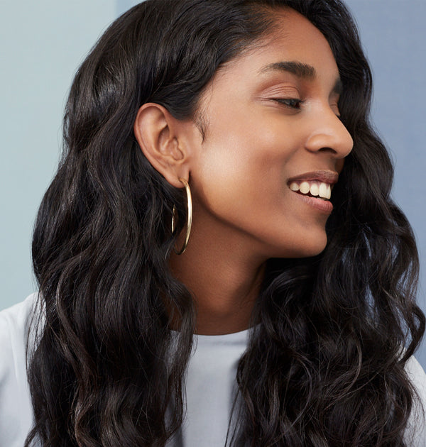
Hair was, naturally, the primary factor that governed our choice of model… though how body shape and general demeanour reflected each specific Dosha was also important. We wanted you to be able to relate and aspire to each woman, identify, respect and celebrate her individuality. We therefore chose Naomi to represent Vata, her naturally full, very curly hair proving a perfect Dosha match. Jolina’s fine, delicately tousled hair is typical of Pitta types, while Lucy’s long, thick and wavy locks are true Kapha.
With our models in place, we moved on to other aspects of art direction, conscious always to not get too prescriptive with how the Doshas were represented. The colours selected for both backdrops and apparel relate to Ayurveda, though don’t exactly match traditional Dosha colour pairings. The fabrics are fluid, stylish, Indian in heritage – subtly telling our cultural story, though in a modern and thoughtful manner. The rings, bangles and necklaces each model wears are ultra-contemporary, yet also tip their hat to the copper and metallic style of Indian pieces.
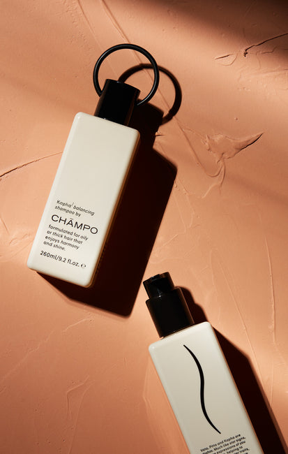
With the studio sets, Vata’s cool creativity, lightness and joy are represented through clean, neutral blues chosen for fabric screens and Naomi’s clothes. Pitta’s confidence, charisma and determination shine through in the soft pink hues and sophisticated styling of Jolina’s clothes. Finally, Kapha’s patient and compassionate nature, as well as this Dosha’s inherent imbalance, are reflected in the interplay between neutral-toned, flowing fabric backdrops, the strong accents in Lucy’s clothing and her relaxed demeanor. The same consideration went into staging our product photography – the subtle, contemporary style of our bottles contrasting with tactile fabric, textured plasterwork and accent colours.
Lighting and composition for both product and model imagery was of great importance – hence our decision to work with photographer Sam Copeland – the resulting warm tones and natural shadows imbuing a sense of intimacy and natural beauty. In all, the final images required minimal post-production (tattoos, skin blemishes and the odd loose hair only make them more representational) – hopefully testament to our firm commitment to delivering something sincere, familiar and real.
When it came to depicting our botanicals, we desired something a little different, something that captured the noble essence of each active. We found it in illustration; the distinctness of each brush stroke representing a nod to the time-honoured principles that guide our ingredient choices while also sublimely complementing the rich, tangible and authentic style of our photographic imagery.
In conclusion, while you can’t judge a book by its cover, on an overpopulated ‘shelf’, our non-conformist stance, originality, accessibility and distinctive detailing hopefully makes Chāmpo stand apart from the rest... and tempts you to take a closer look.
© 2019, all rights reserved.


